In signal processing, noise is a signal that distorts the data we are trying to analyze (fig. 1). There are various ways we can try to analyze and monitor this noise. For example, the Fourier transform can deconstruct a signal into a sum of various sine waves. By looking at the frequencies of these sine waves and their various relative powers, we can see what frequencies from which our signal is composed. Sharp lines in the frequency vs. power spectrum can be indicative of noisy frequencies; we then may decide to apply various filters to minimize the affect of this noise.
|
In the MAJORANA DEMONSTRATOR, waveforms we collect have this noise riding along the signal. In order to analyze it, we offset the detector to pick up a large baseline before displaying our signal. Using code I developed in C/C++, we can use this baseline to perform a Fast Fourier Transform (FFT) to see where noise is present in our system. We can perform this analysis on waveforms alone to get their power at each frequency. Then, we can take multiple waveforms and create a 2D histogram where the x-axis is waveform number, the y-axis is frequency, and each bin in the graph is weighted by its power (displayed as a color). Finally, we can average the power at each frequency over an entire run (about 1 hour of data taking) to see the general noise trend within a given time period (fig. 2).
With the FFT from our Ge detector, we can see which frequencies have the most power. However, how could we know whether this signal was coming from a physics event, or from some external noise source? This is where software defined radio (SDR) comes in. SDR allows us to use a small USB dongle to digitize incoming radio frequency (RF) data from an antenna. By digitizing the data almost immediately, most analysis and data cleaning that needs to be done can all be done on a computer instead of with expensive radio equipment. The SDR takes in RF signals as a frequency and power data. Then, I used python code to take in RF data, plot it on a graph, and animate the graph as time progresses. This gave us the ability to see the baseline RF we had in our lab in real time. All of the data for frequency, time, and signal strength was sent to an Excel file for further analysis. The code was then modified to mark large changes in background noise levels and send the time, frequency, and strength of the signal to a separate Excel file of notable events. The background spectrum in our lab from 0 to 100 MHz is shown in figure 3. The next step in my research was to see if we could insert a controlled signal into both the Ge data and SDR data. To do this, we tuned a radio transmitter to 50 MHz and ran a test Ge detector and SDR simultaneously in the same room. Figures 4 and 5 show the results of this test. The 50 MHz signal was received by both the Ge detector (fig. 5) and the SDR device (fig. 6). This proved that we were able to monitor the electromagnetic noise being received by our Ge detector by comping it to the noise external in the lab. This can be helpful in a few ways. First, we could find times when noise levels rise sharply and look back into the lab's data log to see what changed. We may discover that a certain power supply was turned on, so we could try to shield against that or possibly remove the device creating noise. This is also useful in getting rid of false positives. For example, there are some dark matter experiments going on with the MAJORANA DEMONSTRATOR where the signals we are looking for are very low energy. If there is a lot of noise, the signal could be completely dwarfed and sometimes noise levels may spike some and create signals that look like the event for which we are searching. By comparing the Ge data to the SDR data, we could then tell if the "dark matter signal" was instead noise present in the entire lab. In the future, we will move the SDR monitoring device to the MAJORANA lab in Lead, SD. We also will change the SDR device to run off of a Raspberry Pi. This would make the setup more portable and also reduce the noise we would introduce into the lab (a laptop puts out a significant amount of EM noise). All of the code I wrote in this project can be found in the repositories on my GitHub account linked here. |
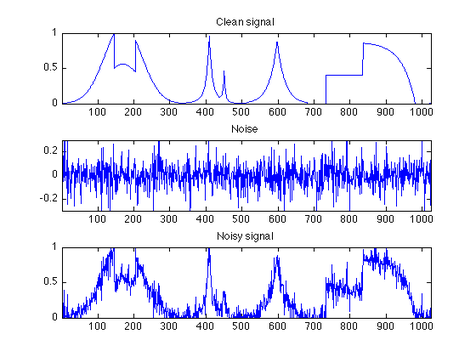
Fig. 1: (Top) Original, clean signal,
(Mid) Random noise distribution,
(Bottom) Noisy Signal,
Credit: Peyre 2009
Fig. 2: All of this data is from the MAJORANA DEMONSTRATOR in Lead, SD.
First: (Bottom) The waveform being analyzed, (Top) the result of an FFT on the data. Peaks can be seen around low frequencies and 12 MHz. Second: A 2D histogram showing the frequency and power data for multiple waveforms. Noisy bands can be seen at low frequencies, 12 MHz, and roughly 45 MHz. Third: A 2D histogram of frequency and power data for multiple runs (1 hour of data collection). Ru 20748 can be seen to be significantly noisier than other runs; we would want to see what changed in the lab to change the noise levels. 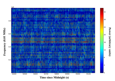
Fig. 3: A 2D histogram of frequency (y-axis), time (x-axis), and power (color) taken inside the UNC Chapel Hill lab where we were testing various Ge detectors as well.
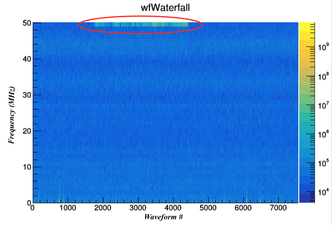
Fig. 4: This is the result of an FFT on the data coming from our test Ge detector in the lab. The 50 MHz signal can be seen at the top of this graph.
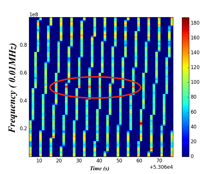
Fig. 5: This is the data from the SDR device. The 50 MHz signal can be seen in the middle.
|
